Diner landing design
Who this is for
Product, growth, and marketing partners shipping the diner-facing UmaMeats experience — especially the www.umameats.com homepage and social creatives that show the customer app on a phone.
This page captures the landing redesign (Curist-style phone-forward hero), the four full-page mockups, and the UX rules we locked so brand and conversion stay consistent.
Live site: www.umameats.com
Marketing home: umameats-marketing.vercel.app
1. What we shipped
| Surface | Outcome |
|---|---|
| Diner marketing homepage | Phone-forward App Store landing (green hero + real app screens) |
| Primary CTA | App Store + Google Play badges (waitlist /join secondary only) |
| Brand | Marketing green #6ea356 (brand-400) — do not invent a new palette |
| Wordmark | Ümameats as hero-level brand signal |
| Code | umameats-landing-saas → DinerLandingPage.tsx |
Page spine (shipped)
- Nav + Download
- Green hero + phone (home screen) + store badges
- Three feature beats (DineSafe · honest prices · membership)
- Benefits split (tracking phone + checklist)
- How it works
- Screenshot strip (restaurant / home / cart)
- Featured stores carousel
- FAQ
- Green download footer
2. Landing mockups (full canvas)
Four POV mockups generated from customer app screens + reference layouts. Primary direction shipped: mockup 01 (Curist hero). Use 02–04 for alternate creatives and mid-page inspiration.
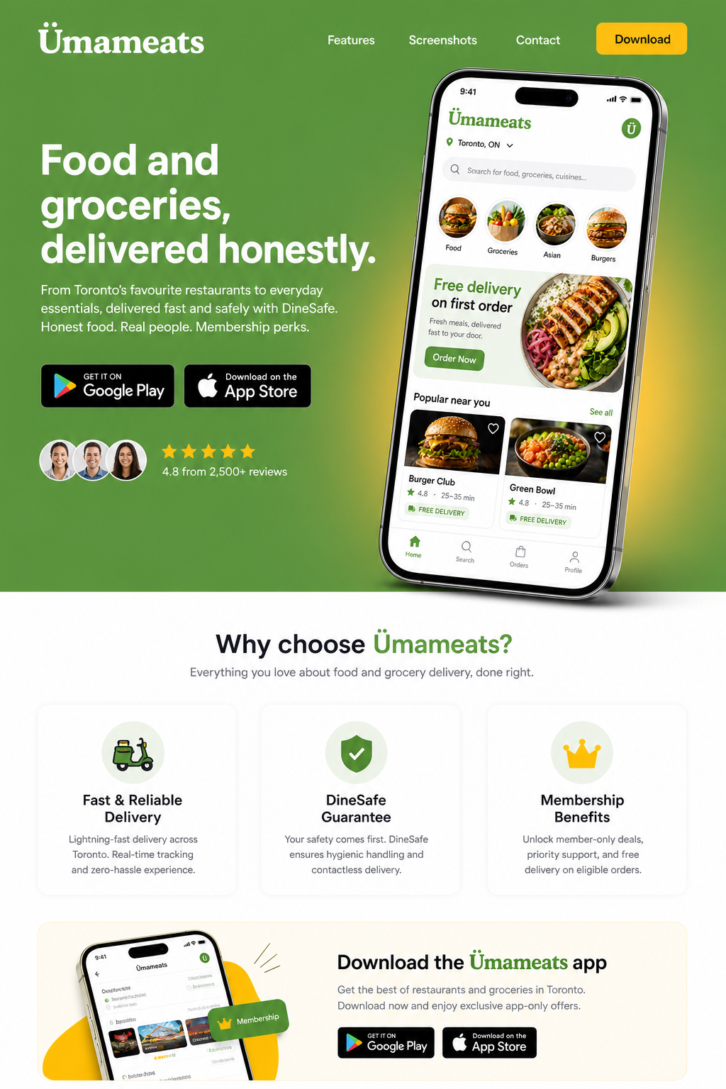
01 — Curist-style hero (shipped spine)
Full brand-green hero, copy left, large phone right, App Store / Play badges.
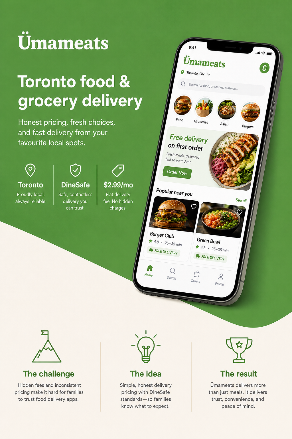
02 — Kidslox-style split
Diagonal / split green field, tilted phone, stats row.
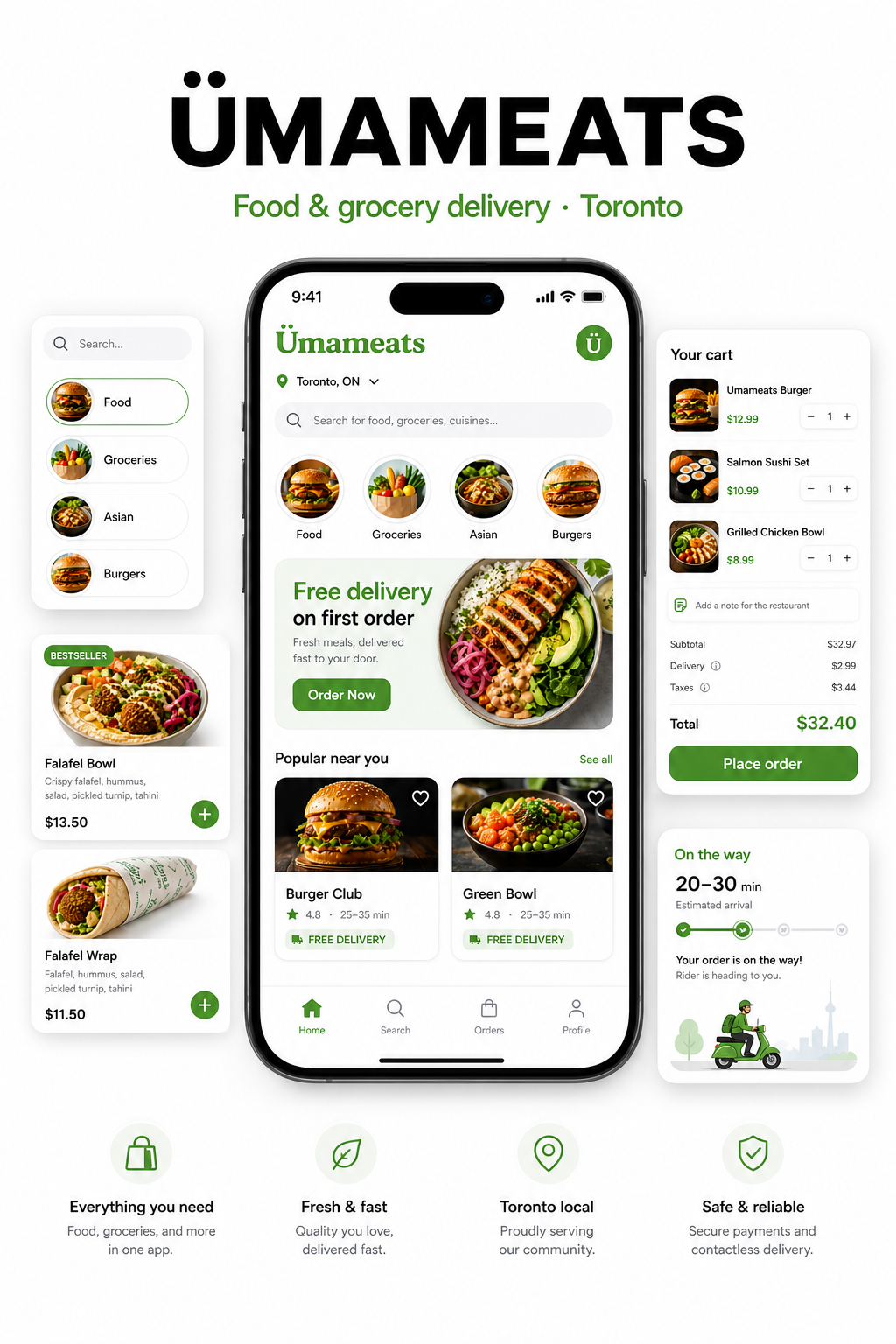
03 — GOFU-style phone explosion
White canvas, centered phone + floating UI cards (home / restaurant / cart).
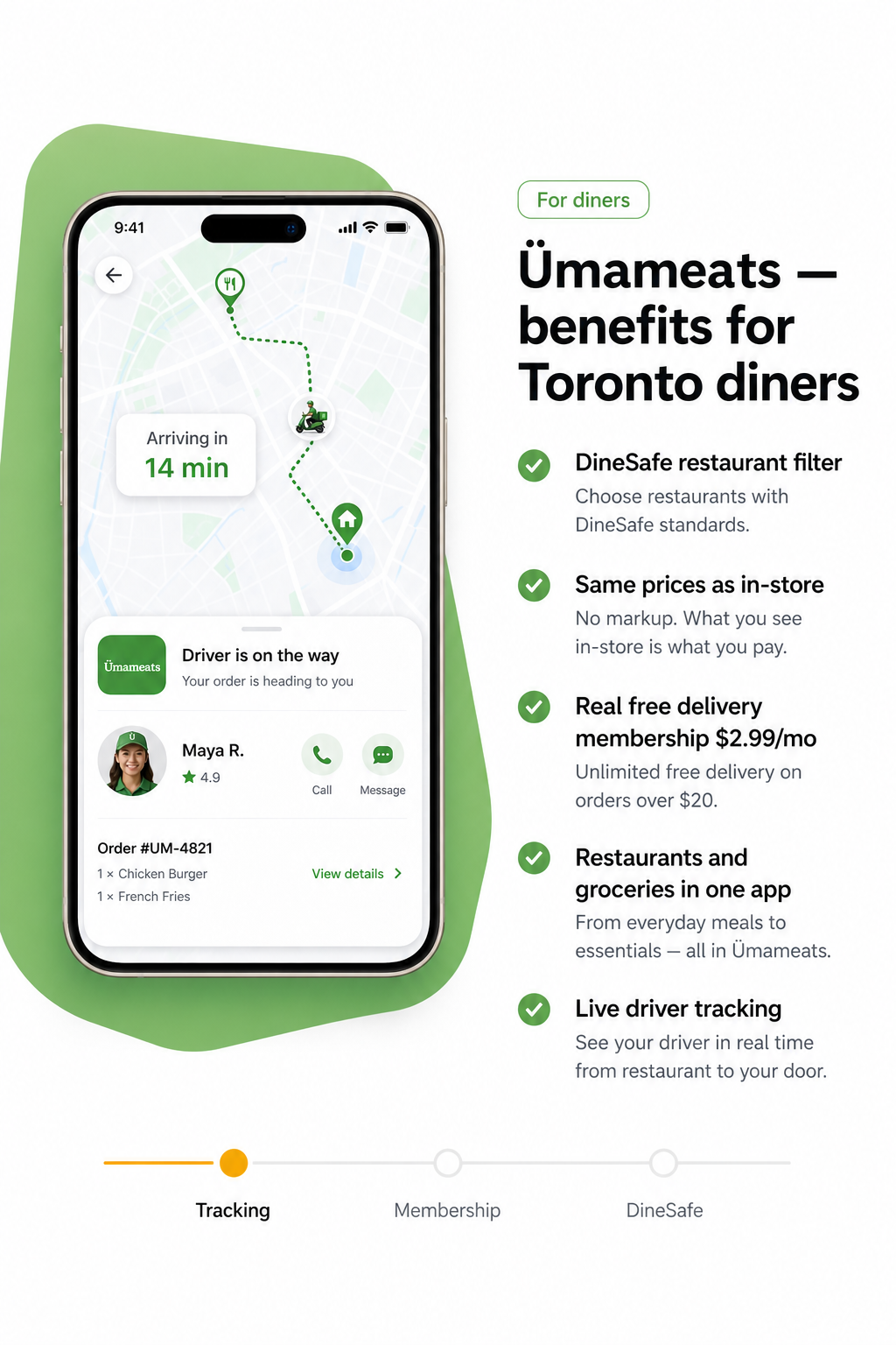
04 — Benefits split
Tracking map phone left, diner benefits checklist right.
Source files (repo): UmaMeats/docs/design-mockups/landing/
Phone art source of truth: UmaMeats/docs/design-mockups/customer/ — best hero set: home · restaurant · cart · tracking.
3. Design playbook (reuse this)
Process
- Generate 4 POV mockups first (hero / split / phone-explosion / benefits).
- Pick a spine (default: Curist-style).
- Implement on the diner homepage only — leave merchant
/restaurantsalone unless asked. - Deploy production.
Composition rules that worked
- Brand first — wordmark hero-level, not a nav-only label.
- One job in the first viewport — brand, one headline, one short line, store badges, one dominant phone.
- Real product phones in a CSS device frame (tilt + float) — not stock illustrations.
- Download-first CTAs — wire
NEXT_PUBLIC_IOS_APP_URL/NEXT_PUBLIC_ANDROID_APP_URL(fallback#downloaduntil live). - Motion budget — phone float + feature fade-in + reduced-motion respect. Stop there.
Differentiators to keep in copy
- Toronto DineSafe filter
- Same prices as in-store (no markup story)
- Membership ~$2.99/mo for real free delivery
- Restaurants and groceries
- Live driver tracking
Inspiration refs (adapt angles; keep UmaMeats colors)
Curist (green hero + phone) · Kidslox (diagonal split + tilt) · GOFU (white canvas + floating cards) · clean CRM modular cards.
4. App UX companion notes (from the same sprint)
Mobile diner + driver apps also got navigation/keyboard hardening — useful when shooting app walkthroughs for social:
- One header only — Expo native stack headers off; custom
ScreenHeader/ floating chevron only (no double bars). - Back on every pushed stack screen — tab roots stay without a chevron (correct mobile UX).
- Keyboard = responsive — layout reflows with the pad; iOS Done on
phone-pad/number-pad; tap/drag dismiss so users are never stuck.
Repos: umameats-customer-mobile / umameats-driver-mobile (FormKeyboardScreen, KeyboardDismissArea, KeyboardDoneAccessory).
5. Social creative tips from these mockups
| Asset | Best use |
|---|---|
| 01 Curist hero | Feed / LinkedIn / website screenshot · “Download UmaMeats” |
| 02 Split + stats | Stories / Reels cover frame · Toronto launch |
| 03 Phone explosion | Carousel slide · feature depth |
| 04 Tracking benefits | Reels B-roll end card · “track to your door” |
Always show real UI from the customer mockups folder when promising the product. Burn in: neighbourhood / Toronto + App Store CTA.
6. Checklist before the next landing tweak
- Keep
brand-400/ amber accents — no new palette experiments on production - Primary CTA remains store badges; waitlist only secondary
- Phone art from
docs/design-mockups/customer/(home / restaurant / cart / tracking) - EN + FR strings for any new marketing copy on the landing SaaS
- Set live iOS / Android URLs in Vercel when store listings are public
- Export mockup frames for IG/TikTok before inventing new layouts
Related
- Diner social launch — zone sequencing + first-order funnel
- Getting started — cookbook overview
- Live diner site: www.umameats.com